Table of Contents
- Introduction
- Why Your Book Cover Design Matters
- Step 1: Understand Your Audience and Genre
- Step 2: Choose the Right Visual Elements
- Step 3: Select Typography That Fits the Tone
- Step 4: Pick the Right Colours and Imagery
- Step 5: Include Key Details and Hierarchy
- Step 6: Prepare the File for Printing
- Common Book Cover Design Mistakes to Avoid
- Professional vs DIY Design: Which Is Better?
- Final Thoughts
Introduction
A great book cover can make the difference between a reader stopping to take a second look—or scrolling past your title completely. In a world filled with thousands of new books every day, your cover is your first and most powerful marketing tool.
Whether you’re self-publishing or working with a printer in Singapore, learning the basics of cover design helps you attract readers and ensure your printed book looks professional.
Why Your Book Cover Design Matters
Readers often judge a book by its cover, even if they don’t admit it. A well-designed cover communicates your book’s tone, genre, and quality before a single word is read.
A strong cover:
- Builds trust and professionalism
- Captures attention on bookstore shelves and online listings
- Helps your book stand out in search results and ads
- Sets reader expectations and attracts the right audience
Step 1: Understand Your Audience and Genre
Before you start designing, define who your readers are. Each genre has its own visual language.
- Romance novels often use soft tones, elegant typography, and emotional imagery.
- Thrillers rely on bold contrasts and sharp fonts.
- Non-fiction tends to use clean layouts and structured hierarchies.
Study best-selling books in your genre. Notice their colour schemes, layouts, and font choices. Use these insights as a creative foundation rather than direct imitation.
Step 2: Choose the Right Visual Elements
The main components of a book cover include:
- Title and author name
- Imagery or illustration
- Subtitle or tagline
- Publisher logo (if any)
- Spine and back cover details
Your imagery should reflect your story or topic without overcrowding the design. Use one main focal point—like a single image, illustration, or pattern—and allow space for text and breathing room.
Remember, simplicity often sells better than clutter.
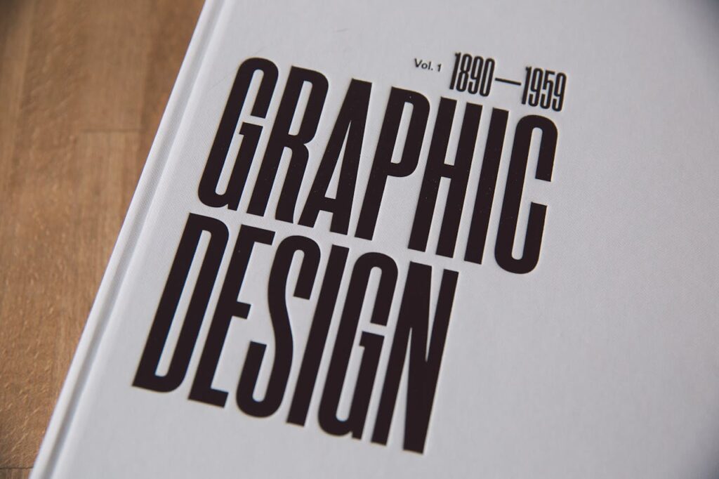
Step 3: Select Typography That Fits the Tone
Typography sets the mood. It should be readable, balanced, and suitable for your genre.
- Use serif fonts (e.g., Garamond, Baskerville) for classic or literary works.
- Choose sans-serif fonts (e.g., Helvetica, Lato) for modern or non-fiction titles.
- Keep contrast between title and subtitle to create visual hierarchy.
Avoid using too many fonts. One or two font families—used consistently for the title, author name, and supporting text—are enough for a polished design.
Step 4: Pick the Right Colours and Imagery
Colours evoke emotions before words do.
- Blue conveys trust and calmness.
- Red attracts attention and conveys energy or passion.
- Black and white give a minimalist and sophisticated feel.
If your book will be displayed online, ensure the cover looks good both in full size and thumbnail view. High-contrast designs perform better in small previews.
Use high-resolution images (at least 300 DPI) and ensure all visuals are licensed or royalty-free if not original.
Step 5: Include Key Details and Hierarchy
A book cover should clearly communicate:
- The title (most prominent)
- The author name (secondary)
- Any subtitle, tagline, or series title (supporting information)
You may also include:
- A short quote or review (optional)
- Publisher logo or imprint
- Barcode and ISBN on the back cover
Use alignment and spacing to guide the reader’s eyes naturally through the design.
Step 6: Prepare the File for Printing
Even the most beautiful design can fail if it’s not print-ready. Work with your printer or book printing service in Singapore to confirm specifications.
Typical print setup requirements:
- Resolution: 300 DPI minimum
- Colour mode: CMYK (not RGB)
- Bleed: At least 3mm beyond each edge
- Spine width: Calculated based on paper thickness and page count
Most printers accept files in PDF or TIFF format. Always review a proof copy before mass printing.
Common Book Cover Design Mistakes to Avoid
- Using low-resolution images that look blurry in print
- Overcrowding the cover with too much text or too many graphics
- Ignoring contrast between text and background
- Choosing fonts that are hard to read or inconsistent in style
- Skipping bleed margins, causing text to be cut off in print
- Forgetting the spine or back design, which impacts the overall look
Professional vs DIY Design: Which Is Better?
If you have design experience, tools like Adobe InDesign, Canva, or Affinity Publisher can help you create a decent cover. However, hiring a professional designer often yields stronger results—especially for commercial books.
A professional designer ensures:
- Proper print setup and file format
- Consistent branding and typography
- High-quality visuals and composition
- A design that sells well in both digital and print markets
The investment is small compared to the impression it makes on potential readers.
Final Thoughts
Your book cover is more than just decoration—it’s a marketing tool that communicates your story, style, and value in seconds.
Take time to research, design, and refine. Whether you’re publishing a novel, a memoir, or a business book, a thoughtfully crafted cover can significantly increase your book’s visibility and sales.
If you’re planning to print your book in Singapore, partner with a reliable book printing company that understands design specifications and can ensure your cover looks as good in print as it does on screen.