When printing a book, one of the most important decisions is whether to use colour printing or black and white printing. This choice affects not only the cost, but also readability, visual impact, and the overall professionalism of your book.
Choosing the wrong option can make your book look either too expensive or visually underwhelming. This guide will help you decide which is right for your project.
Table of Contents
- Understanding Colour vs Black and White Printing
- What Is Colour Book Printing?
- What Is Black and White Book Printing?
- Cost Differences Explained
- Print Quality and Visual Impact
- Best Use Cases for Colour Printing
- Best Use Cases for Black and White Printing
- Hybrid Printing (Mixing Colour and B&W)
- How Printing Method Affects Colour Output
- Common Mistakes When Choosing Print Type
- How to Decide Which Option Is Right for You
- Final Recommendation
1. Understanding Colour vs Black and White Printing
At a basic level:
- Colour printing uses a full CMYK spectrum (cyan, magenta, yellow, black) to produce full-colour images and graphics
- Black and white printing uses only black ink (or grayscale tones)
While this seems simple, the impact on your book’s design, cost, and purpose is significant.
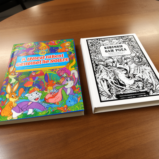
2. What Is Colour Book Printing?
Colour book printing produces pages with full-colour visuals, including:
- Photographs
- Illustrations
- Charts and diagrams
- Highlighted text or design elements
It is commonly used for books where visual presentation matters as much as content.
3. What Is Black and White Book Printing?
Black and white printing (also called grayscale printing) uses varying shades of grey to represent images and text.
It is ideal for:
- Text-heavy books
- Novels
- Academic materials
- Manuals and reports
It focuses on clarity and readability rather than visual appeal.
4. Cost Differences Explained
One of the biggest differences is cost.
Colour printing:
- Higher production cost
- More expensive per page
- Best for image-heavy books
Black and white printing:
- Much cheaper per page
- Cost-efficient for large volumes
- Ideal for bulk printing
Simple comparison:
| Printing Type | Cost Level | Best For |
|---|---|---|
| Colour | High | Visual books, branding |
| Black & White | Low | Text-heavy content |
5. Print Quality and Visual Impact
Colour printing:
- Vibrant and visually engaging
- Enhances branding and design
- Makes images and illustrations stand out
Black and white printing:
- Clean and minimal look
- Focuses attention on content
- More traditional publishing style
If your book relies on visuals, colour is almost always the better choice.
6. Best Use Cases for Colour Printing
Colour printing is ideal for:
- Children’s books
- Cookbooks
- Photography books
- Art and design portfolios
- Corporate brochures and branding books
- Educational books with diagrams
If visuals are part of your message, colour printing enhances value significantly.
7. Best Use Cases for Black and White Printing
Black and white printing is best for:
- Novels and fiction books
- Academic textbooks (text-heavy)
- Training manuals
- Journals and workbooks
- Draft manuscripts or sample prints
It keeps production cost low while maintaining readability.
8. Hybrid Printing (Mixing Colour and B&W)
Many modern books use a mixed approach:
- Colour cover + black and white interior
- Selected colour pages (e.g. diagrams or highlights)
- Colour inserts in specific chapters
This helps balance cost and visual quality.
9. How Printing Method Affects Colour Output
The printing method also affects how colour appears:
- Digital printing: consistent colour, good for short runs
- Offset printing: more accurate colour matching, better for large runs
Even in colour printing, results depend heavily on file preparation and calibration.
10. Common Mistakes When Choosing Print Type
Many authors make these mistakes:
- Choosing colour when not necessary (increases cost unnecessarily)
- Using black and white for image-heavy books (reduces quality)
- Not considering target audience expectations
- Ignoring printing budget vs value trade-off
A poor decision here can affect both sales and reader experience.
11. How to Decide Which Option Is Right for You
Ask yourself these questions:
1. Does my book rely on images or visuals?
- Yes → choose colour
- No → black and white is enough
2. Is budget a key concern?
- Yes → black and white or hybrid printing
3. What is my audience expecting?
- Corporate or premium audience → colour preferred
- Academic or fiction readers → black and white is acceptable
4. Will colour improve understanding?
- If yes → invest in colour printing
12. Final Recommendation
Choosing between colour and black and white printing is not just a cost decision—it’s a strategic publishing choice.
- Use colour printing when visuals enhance meaning, branding, or reader engagement
- Use black and white printing when clarity, cost efficiency, and readability are the priority
- Consider a hybrid approach when you want balance between cost and impact
Final Thoughts
A well-printed book is not only about content—it is about presentation. The right printing style ensures your message is delivered clearly and professionally.
By understanding when to use colour or black and white printing, you can create a book that is both cost-effective and visually appropriate for your audience.